
A sales performance metrics dashboard pulls all your key sales data into one place, in real-time. It’s a command center that turns messy numbers into clear, actionable insights. Think of it as the ultimate at-a-glance view of your team's most important key performance indicators (KPIs), helping you track progress, spot trends, and make smart decisions on the fly.
Why Spreadsheets Are Holding Your Sales Team Back
If you’ve ever tried to make sense of a massive spreadsheet packed with sales data, you know it’s like trying to navigate through a dense fog. The information is technically there, but good luck finding a clear path forward. This static approach keeps sales leaders stuck in the past, analyzing last month's numbers instead of shaping this month's results.
The real problem with spreadsheets is that they're disconnected, manual, and almost instantly out of date. Your reps and managers end up wasting precious hours—time that could be spent selling—exporting data, updating cells, and wrangling formulas. This isn't just inefficient; it's a magnet for mistakes. In fact, studies have shown that nearly 90% of spreadsheets contain errors.
The Shift to Dynamic Decision-Making
This is where a dedicated sales performance metrics dashboard changes the game, especially when it’s built right inside your CRM. It connects directly to your single source of truth—the CRM itself—which means the data is always live and always accurate. The dashboard stops being a historical artifact and becomes a living, breathing tool you can use every single day.
Moving from static spreadsheets to dynamic dashboards isn't just a minor upgrade; it's a strategic must-do. To get a better handle on what this move entails, both technically and culturally, you can learn more about making the move from Excel to a centralized database.
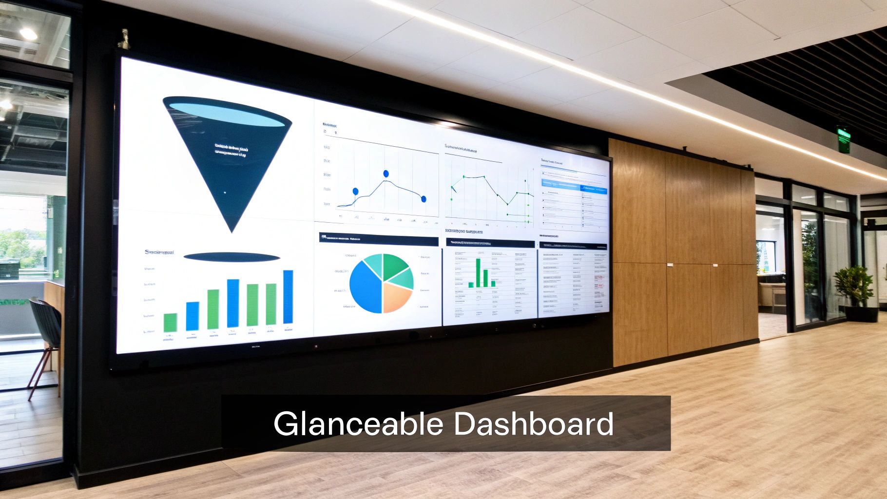
Here’s a quick look at what a clean, effective dashboard can look like right inside a CRM.
This kind of visual tells you a story about your pipeline's health, team activity, and conversion rates instantly—something a spreadsheet just can't do with the same clarity.
From Numbers to Narratives
At the end of the day, a well-designed dashboard does more than just show you numbers; it tells a compelling story about your team's momentum. You can immediately see which reps are crushing it, where deals are getting stuck, and exactly how close you are to hitting your quarterly targets.
A dashboard moves you beyond simply tracking performance to actively improving it. It's the difference between reading the box score after the game and having a coach on the sidelines calling plays in real time.
This real-time visibility empowers B2B sales teams to confidently navigate complex, multi-stakeholder deals, turning crucial insights into tangible wins.
Choosing B2B Sales Metrics That Actually Matter
A sales dashboard is only as good as the data you feed it. If you stuff it with vanity metrics, you just create a lot of noise. But if you focus on too few, you can create dangerous blind spots in your strategy. The real goal is to pick KPIs that actually move the needle for your B2B team, giving everyone instant clarity on what to do next to win.
This is where the difference between leading and lagging indicators becomes so important. Think of it like driving a car: lagging indicators are the milestones you see in the rearview mirror, while leading indicators are the road signs telling you what’s coming up.
Leading vs. Lagging Indicators: What to Track
Lagging indicators are all about past results. They’re essential for seeing what you’ve accomplished and confirming you hit your targets. Things like Total Revenue and Customer Lifetime Value (CLV) fall squarely into this category.
Leading indicators, on the other hand, are predictive. They track the day-to-day activities that lead to those bigger results. Think Calls Made, Meetings Booked, and Pipeline Growth. A dashboard that strikes the right balance between both gives you the complete picture of your sales engine's health—where it's been and where it's headed.
The difference is like night and day. You go from foggy, outdated spreadsheets to a dashboard that gives you a clear, real-time view of what's happening.
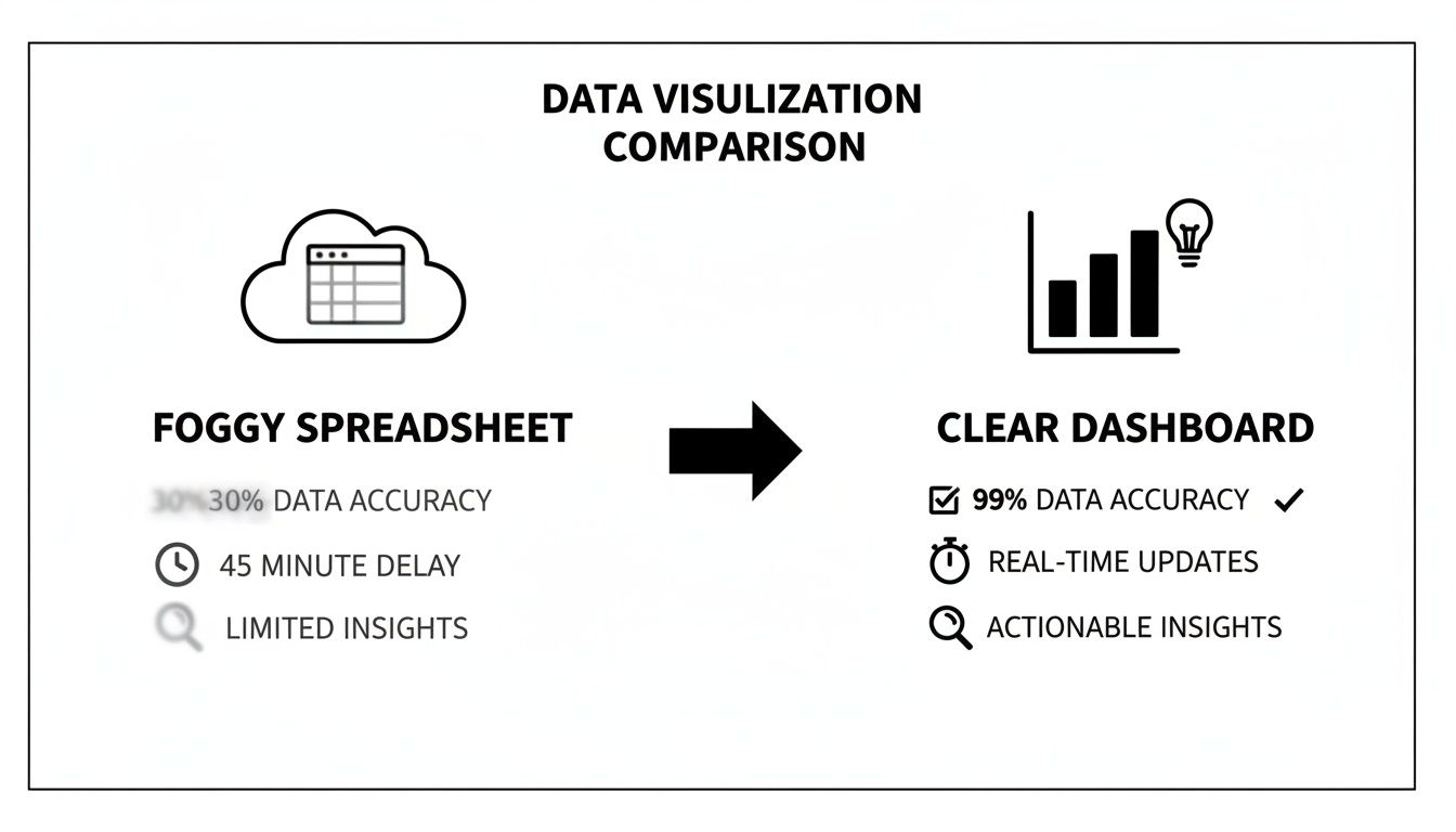
This visual really drives home how a great dashboard turns raw data into a clear path forward. It empowers your team with information they can act on now, instead of waiting for last month's report.
Aligning Metrics with Business Goals
Your metrics have to be a direct reflection of your company’s core objectives. It’s that simple. If your main goal this quarter is to grab more market share, then you need to be laser-focused on metrics like New Logos Acquired and Pipeline Velocity.
Let’s get specific. Imagine a B2B SaaS company trying to land bigger enterprise clients. Their dashboard shouldn't look anything like a team focused on high-volume SMB sales. It should prioritize:
- Average Deal Size to make sure reps are hunting the right-sized accounts.
- Sales Cycle Length to understand the complexity and resource drain of these larger deals.
- Number of Stakeholder Meetings Booked to track how deep they’re penetrating target accounts.
On the flip side, a team that handles a ton of inbound leads needs to watch Lead Response Time and Lead-to-Opportunity Conversion Rate like a hawk. The key is to build a dashboard that tells the story your business needs to hear.
A dashboard isn’t just a collection of charts; it’s a strategic compass. It should point every member of your sales team toward the activities that generate the most revenue and align with the company's biggest goals.
Essential B2B Sales Dashboard KPIs
While every dashboard needs a personal touch, some metrics are just non-negotiable for B2B sales teams. To help you get started, here’s a breakdown of KPIs you should absolutely consider, organized by what they help you measure.
| Metric Category | Example KPIs | What It Measures |
|---|---|---|
| Sales Outcomes (Lagging) | Win Rate, Total Revenue, Average Deal Size | The final results of your sales efforts and overall team effectiveness. |
| Sales Activities (Leading) | Calls Made, Emails Sent, Demos Booked | The volume and consistency of your team's day-to-day outreach. |
| Pipeline Health (Leading) | Pipeline Value, Sales Cycle Length, Conversion Rates | The flow, speed, and quality of opportunities moving through your funnel. |
| Sales Efficiency (Hybrid) | Lead Response Time, Quota Attainment | How effectively your team converts effort into revenue. |
This table gives you a solid foundation. You can pick and choose from these categories to create a balanced view that covers both past performance and future potential.
One of the most powerful lagging indicators on that list is win rate. It's a raw, honest measure of your team's effectiveness and immediately flags where coaching is needed. The average B2B win rate often sits around 20-21%, but I’ve seen top-performing teams consistently hit 30% or higher. When you visualize this on your dashboard—broken down by rep, lead source, or deal stage—you can instantly spot what’s working and what isn’t.
Another one I always tell managers to watch is sales cycle length. For SMEs handling complex deals with multiple decision-makers, knowing how long it takes to close a deal is vital for forecasting and resource planning. If you see that cycle time start to creep up, it could be a red flag for a broken qualification process or new competitive pressure.
Finally, you can’t have a dashboard without activity metrics. These are your foundational leading indicators.
- Calls and Emails Sent: How much outreach is happening?
- Meetings Scheduled: Is that outreach actually working?
- Proposals Sent: Are we moving deals to the final stages?
Tracking these simple activities helps you understand the relationship between effort and results. It makes it so much easier to coach a rep who is putting in the work but not getting the wins.
For a deeper dive, check out our guide on essential sales performance metrics examples to get more ideas for your dashboard. By selecting a smart mix of leading and lagging indicators tied directly to your goals, you’re not just building a report; you’re building a tool that drives growth.
Designing a Dashboard That Your Team Will Actually Use
Picking the right metrics is a great start, but it's only half the battle. You can have the most insightful data in the world, but if your sales performance metrics dashboard is a cluttered, confusing mess, your team will simply stop using it. The real goal isn't just to show numbers; it's to build a tool that feels so intuitive and valuable that it becomes a non-negotiable part of your sales team’s daily routine.
This all boils down to one simple idea: glanceability. A sales manager needs to be able to look at their dashboard and, in less than 30 seconds, know exactly what's happening—what’s on track, what’s falling behind, and which reps need a hand. Anything more complicated than that just won't get used. It's the difference between a tool that sparks action and a report that gets archived.
Choosing the Right Visual for the Right Metric
How you visualize your data can either tell a clear story or hide it completely. One of the most common mistakes I see is people throwing every metric into a pie chart, which usually just creates confusion. Every chart type has a specific job, and getting this right is fundamental to a useful dashboard.
- Line Charts: These are your best friend for tracking performance over time. Think about visualizing trends in your monthly recurring revenue (MRR) or the value of your pipeline over the quarter.
- Bar Charts: Perfect for making comparisons. Use them to stack up quota attainment between reps or see which lead sources have the best win rates.
- Funnel Charts: Nothing beats a funnel chart for seeing how deals move through your sales process. It instantly shows you where deals are getting stuck.
- Scorecards (or Number Displays): For those single, can't-miss KPIs, a big, bold number display is perfect. This is for things like total deals closed this month or average deal size.
When you match the metric to the right visual, you make the data incredibly easy to digest. That’s the secret sauce.
Tailoring Dashboards for Different Roles
A one-size-fits-all dashboard is a recipe for failure. Your CEO, a sales manager, and an account executive all need different information to be successful. A good CRM, like HubSpot or Salesforce, will let you build and assign dashboards based on roles.
For an Executive or CEO, the dashboard should be a high-level, strategic snapshot. It’s all about the big picture.
- Total Revenue vs. Goal
- Year-over-Year Growth
- Customer Acquisition Cost (CAC)
- Overall Pipeline Health
A Sales Manager’s dashboard is more tactical, focused on team performance and pipeline management. This is their command center for coaching reps and building an accurate forecast.
- Team Quota Attainment
- Win Rate by Rep
- Average Sales Cycle Length
- Deals at Risk (i.e., stalled in a stage for too long)
And for an Account Executive, the dashboard needs to be purely operational. It’s all about their personal activities and their own pipeline.
- Personal Quota Attainment vs. Pace
- Number of Meetings Booked This Week
- Open Opportunities by Stage
- Upcoming Tasks and Follow-ups
When everyone has a dashboard built for them, adoption goes through the roof because the tool actually helps them do their job better.
The most effective dashboards are not built for the company; they are built for the people who use them every day. Personalization is the key that unlocks consistent engagement and data-driven action.
Using Layout and Color to Guide the Eye
Great dashboard design isn't an accident; it's intentional. You have to use layout, color, and grouping to pull the user's eye to the most important information first. Think of it like the front page of a newspaper—the biggest headlines are always at the top.
Always place your most critical KPIs—like team quota attainment or total pipeline value—in the top-left corner. That’s where our eyes naturally start. Then, group related charts together to create logical sections. For instance, put all your activity metrics (calls, emails, meetings) in one block and all your pipeline metrics in another.
Color should be used with purpose, not just to make things look pretty. Stick to a consistent palette and use colors like red and green strategically to signal performance. A red number showing you’re behind on the monthly target is an instant, universal signal that doesn't need explaining. This is how you turn a simple sales performance metrics dashboard from a data dump into a powerful decision-making tool.
Building and Automating Your Dashboard Within Your CRM
Alright, you’ve picked your metrics and have a solid design in mind. Now for the fun part: bringing your sales performance metrics dashboard to life. This is where your strategy moves from a document into a real, working tool your team will use every day.
Building this dashboard directly inside your B2B CRM isn't just a nice-to-have; it's essential. This guarantees your data is always live and accurate, pulling from the single source of truth your team already relies on.
Connecting Your Data and Building Widgets
The first step is hooking up the data sources you already have in your CRM. Don't worry, this isn't about complicated integrations. It's about tapping into the information you're already tracking—deal pipeline stages, contact records, company details, you name it. Most modern CRMs make this a breeze with simple, drag-and-drop interfaces.
Dashboard builders in CRMs typically use a widget-based system. Think of each widget as a mini-report for a specific metric: a bar chart showing quota attainment, a funnel visualizing conversion rates, or a scorecard with total revenue. Your job is to translate the KPIs you chose earlier into these visual blocks.
For instance, to track Pipeline Value, you'd create a widget that adds up the dollar value of all your open deals. To monitor Sales Cycle Length, you'd set up a report to calculate the average time it takes for a deal to go from creation to "closed-won."
Here’s a look at what a typical CRM dashboard builder looks like. You can see how you can pick a chart type and tell it what data to show.
The beauty of this is its simplicity. You can select a metric, pick how you want to see it, and drop it onto your dashboard canvas—all without writing a line of code.
A perfect example for any B2B sales team is the lead conversion rate. It’s a critical metric that shows what percentage of your leads turn into real, qualified opportunities. For teams with longer sales cycles, this is huge. In fact, benchmarks show that CRM users see a 17% higher lead conversion rate. Why? Because an integrated dashboard helps you spot where leads are dropping off, so you can focus on the sources that actually generate revenue. This is a major contributor to the 29% boost in overall sales revenue that a solid CRM can bring. For a deeper dive, you can read the full research on powerful sales metrics on monday.com.
Unleashing the Power of Automation
A static dashboard is helpful, but an automated one is a force multiplier. The real magic happens when your sales performance metrics dashboard can trigger actions, turning insights into instant responses without anyone lifting a finger. It stops being just a report and becomes an active part of your sales process.
Your goal is to build a living system that works for you. A great place to start is with smart alerts and notifications.
- Slack/Teams Alerts: Set up a rule to ping a sales manager’s channel whenever a high-value deal has been stuck in the same stage for over 10 days.
- Email Summaries: Automate a weekly performance email that gives each rep a snapshot of their key numbers, like activities logged and new pipeline created.
- Task Creation: If a rep’s "demos booked" number drops below their weekly goal, have the system automatically create a task in their CRM to schedule a "prospecting power hour."
Automation turns your dashboard into an early warning system. Instead of waiting for a weekly meeting to discover a problem, the system flags it for you the moment it happens, giving you a critical head start.
Using Workflows to Eliminate Manual Work
Beyond basic alerts, you can build entire workflows that kick off based on what the dashboard is showing. This is where you can save your team a ton of time, freeing them up to do what they do best: sell. Of course, this all hinges on a well-planned CRM implementation. For some practical steps on that, our guide on how to implement a CRM system is a great resource.
Think about these real-world automation scenarios:
- Automated Lead Routing: A dashboard widget tracks incoming leads by source. When a lead from a "High-Priority" source (like a demo request) arrives, a workflow can instantly assign it to the top-performing rep for that territory.
- Proactive Follow-ups: A deal’s "Last Contacted" date hits 14 days? A workflow can automatically send a templated "just checking in" email from the deal owner, so nothing goes cold.
- Customer Onboarding Handoff: The second a deal is marked "Closed-Won," a workflow can notify the customer success team and send them all the client's details, ensuring a perfectly smooth handoff every time.
By building these kinds of automations, you're not just looking at data—you're putting it to work to drive efficiency and make sure no opportunity ever slips through the cracks.
Turning Dashboard Insights into Actionable Coaching
A slick-looking sales performance metrics dashboard is nice to have, but let's be honest—its real value isn't in the pretty charts. The magic happens when you use it to spark action. Data sitting on a screen is just noise; it's what you do with it that separates a good sales leader from a great one. This is all about shifting from just reporting on what happened last month to actively shaping what happens next.
Your goal here isn't to use the dashboard as a scoreboard to judge your team. Think of it more like a compass, guiding you toward productive, data-driven conversations that actually empower your reps, rather than making them feel like they're under a microscope.

From Observation to Intervention
Spotting a red flag on the dashboard is the easy part. The real skill is knowing what questions to ask and how to frame the conversation without putting your reps on the defensive.
Let’s walk through a classic scenario. You notice a rep’s lead-to-opportunity conversion rate has tanked by 15% over the last month. The knee-jerk reaction for an inexperienced manager is to open with, "Your conversion rate is down. What's going on?" This kind of opening immediately puts people on the back foot.
A true coach, however, sees the dashboard as a starting point for curiosity. A much better approach would be something like, "Hey, I was looking at the team dashboard and saw a shift in our lead conversion rates. Let's pull up your recent leads and walk through them together. Are you feeling like the quality has changed, or are you running into new objections right out of the gate?"
See the difference? It’s collaborative. It’s about solving a problem together, not assigning blame.
Structuring Data-Driven Coaching Sessions
Your one-on-one meetings are the perfect place to put these dashboard insights to work. It’s time to move beyond the generic "how's it going?" check-ins and start having highly specific, impactful conversations.
Here's a simple, effective framework for your next 1-on-1:
- Celebrate a Win: Always start on a high note by pointing out a positive trend from their personal dashboard. "I saw you booked five demos last week from that new outbound sequence—that's fantastic. What's working so well there?"
- Explore an Opportunity: Zero in on one specific area for improvement. "I also noticed a few of your deals have been sitting in the 'Proposal Sent' stage for a while. Let's look at this one together. What do you think our next move should be to get it across the line?"
- Collaborate on a Plan: Don't just point out the problem; build the solution together. "Okay, let's craft a follow-up email for that stalled deal right now. For the others, let's set a goal to touch base with every proposal over 10 days old by this Friday."
This method transforms your sales performance metrics dashboard from a static report into a dynamic coaching playbook. Every conversation becomes productive and forward-looking.
A dashboard should fuel curiosity, not judgment. Use it to ask better questions and co-create solutions with your reps, turning every data point into a potential coaching moment.
Focusing on the Core Performers
It’s easy to spend all your time with your top performers and those who are struggling at the bottom. But the biggest opportunity for growth? It’s almost always with the "middle 60%" of your team—those solid, consistent reps who have the potential to become A-players with the right guidance.
Use your dashboard to find patterns among this core group. Maybe they're great at getting that first meeting but stumble during late-stage negotiations. Or perhaps their average deal size is consistently smaller than the team average. These insights are gold. They allow you to create targeted group coaching sessions or training programs that lift the entire team's performance.
Think about it: a 5% performance increase across that massive middle group will have a far greater impact on revenue than pushing your top rep from 120% to 125% of their quota.
Improving Forecast Accuracy
A dashboard isn't just for coaching individual reps; it's a critical tool for strategic planning and forecasting. By tracking historical data on metrics like sales cycle length and stage-by-stage conversion rates, you can finally move beyond gut-feel forecasts.
For example, your dashboard might show that historically, only 50% of deals that reach the "Proposal Sent" stage actually close, and your average sales cycle is 60 days. Now you can apply these cold, hard facts to your current pipeline for a much more realistic revenue projection.
This means you can walk into a leadership meeting and say with confidence, "We have $2 million in the pipeline. Based on our historical win rates and cycle times, we can realistically expect to close around $600k this quarter." This level of data-driven forecasting is what elevates a sales manager into a strategic business leader. The dashboard gives you the evidence you need to make smarter, more predictable decisions that drive consistent growth.
Got Questions About Sales Dashboards? We've Got Answers
Even after deciding to build a sales dashboard, a bunch of questions usually pop up. It's totally normal. As you start digging in, you'll inevitably run into some common "what ifs" and "how tos." Let's clear the air and tackle some of the things that B2B sales teams ask me most often.
Think of this as your practical FAQ. I want to give you the clarity you need to move forward and build a sales performance metrics dashboard that your team will actually use and love.
What’s the Single Most Important Metric for a B2B Sales Dashboard?
Everyone asks this, hoping for one magic number. The truth? It’s not one metric, but a powerhouse combination: Sales Cycle Length and Win Rate. When you put these two together, you get a remarkably clear picture of your sales engine's health.
Sales Cycle Length tells you exactly how long it takes to turn a prospect into a customer, from that very first "hello" to the final signed contract. This is absolutely essential for forecasting cash flow and knowing where to put your team's energy, especially when deals can drag on for months. If you see your sales cycle getting longer, it’s an early warning that something's off—maybe a new competitor showed up, or a step in your sales process is broken.
Then you have Win Rate, which is your ultimate report card. It’s the raw, honest truth about how good your team is at turning real opportunities into closed-won deals. A dashboard that shows both metrics gives you a 360-degree view of your team’s efficiency (how fast you are) and its effectiveness (how good you are).
I always tell people to pair a leading indicator with a lagging one. For example, tracking Win Rate (a result) alongside something like 'Meetings Booked' (an effort) helps you connect the dots between the daily grind and the final outcome. It tells a much richer story.
How Often Should We Be Looking at Our Sales Dashboard?
There's no one-size-fits-all answer here. The right rhythm depends entirely on who you are and what you need from the data. Staring at it constantly isn't the goal; making it a natural part of your workflow is.
Here’s a simple breakdown I’ve seen work time and time again:
- Sales Reps: Daily. A quick 5-minute check-in each morning is perfect. It helps them set priorities, see where they stand against their quota, and spot which deals need a nudge today.
- Sales Managers: Daily or a few times a week. This frequency allows them to see trends as they form, identify reps who might be getting stuck, and walk into 1-on-1 meetings armed with specific, helpful data instead of vague feelings.
- Leadership/Executives: Weekly or monthly. They're looking for the big picture—overall business health, market trends, and strategic insights. A less frequent, high-level review keeps them informed without getting bogged down in the daily details.
The whole point is to make the dashboard an active tool, not a dusty report that only gets looked at once a quarter.
Can a Good Dashboard Actually Make My Team Sell More?
Yes, absolutely. But there’s a massive catch: a dashboard is a tool, not a magic wand. It can't close deals for you. Its real power is in making problems and opportunities so blindingly obvious that you have to act on them.
A well-designed sales performance metrics dashboard drives improvement by sparking specific, targeted actions.
For instance, you might suddenly see that:
- Leads from a particular webinar have a terrible conversion rate. That's a clear signal to talk to marketing about their targeting or messaging.
- A new rep is a rockstar at booking first meetings but their deals stall out after the proposal. Boom—that’s a perfect, laser-focused coaching opportunity.
Performance goes up because the dashboard gives you the hard data needed to make smarter decisions, coach with precision, and fine-tune your entire sales motion.
What are the Classic Mistakes People Make When Building a Dashboard?
I've seen so many well-intentioned dashboard projects go off the rails. It usually comes down to a few common, and totally avoidable, missteps. If you know what they are ahead of time, you can sidestep a lot of frustration.
The number one mistake is metric overload. It's so tempting to track every single data point you can think of. All this does is create a cluttered, chaotic screen that’s impossible to read, and your team will just ignore it.
Another big one is focusing only on lagging indicators (like total revenue last quarter). That just tells you what already happened. You have to balance those with leading indicators (like new pipeline created this week) that give you a hint of what's coming.
And maybe the most fatal flaw? Building the dashboard in a tool that’s completely separate from your CRM. This guarantees your data will be stale and unreliable, which completely kills trust and adoption. An integrated dashboard means the numbers are always live, always accurate, and always right where your team is already working.